What Your Switch Plate Color Says About Your Home — And How to Use It to Your Advantage
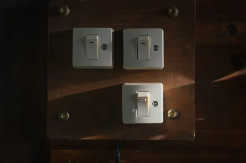
Here's a question most people never think to ask: when was the last time you made a conscious decision about the color of your switch plates?
For most homeowners, the answer is never. You grab whatever comes in the box, slap it on the wall, and move on. But color psychologists and interior designers will tell you that every single surface in a room — yes, including the small rectangular one next to your light switch — plays a role in shaping how that space feels.
And when you're touching those covers multiple times a day, every single day, that influence adds up.
The Science Behind Color and Emotion
Color psychology has been studied seriously since the early 20th century, and by now the research is pretty consistent: colors genuinely affect human mood, behavior, and even physical responses. Warm tones like red and orange can raise heart rate and stimulate energy. Cool blues and greens tend to slow things down and promote calm. Neutrals like white and gray often create a sense of order and mental clarity.
This isn't just abstract theory. Hospitals use soft blues and greens to reduce patient anxiety. Restaurants lean into reds and yellows to stimulate appetite and keep tables turning. Fast food chains didn't pick those colors by accident.
The same principles apply inside your home — but most people only apply them to the big stuff: wall color, furniture, rugs. What gets overlooked are the smaller surfaces that still register in your peripheral vision and subconscious mind every time you walk into a room.
Switch plates are one of those surfaces.
Why Switch Covers Actually Matter in This Equation
Think about it this way: a switch plate sits at roughly eye level (or just below it), often right next to a doorway — which means it's one of the first things your eyes land on when you enter a room. It's also a surface you physically interact with, which creates a micro-moment of tactile and visual attention.
When that cover clashes with the room's color story, it creates a tiny but real moment of visual friction. When it harmonizes — or even intentionally contrasts — it reinforces the emotional tone you're trying to set.
This is why matching or thoughtfully selecting your switch covers isn't just about aesthetics. It's about consistency in the psychological environment you've built.
Room-by-Room Breakdown: Which Colors Work Where
Home Office: Go for Clarity and Focus
If you work from home, your office environment has a direct impact on output. Colors associated with focus and mental clarity tend to be cool whites, soft grays, and muted blues. A crisp white or light gray switch cover in a home office reinforces a sense of order — it visually says this is a place where things get done.
Some designers also recommend soft sage green for home offices, since green is associated with balance and is easy on the eyes during long screen sessions. A sage or muted olive switch plate can subtly anchor that vibe without drawing attention to itself.
Avoid warm reds or bright oranges in work spaces — they stimulate energy in a way that can tip into agitation or restlessness over a long workday.
Bedroom: Lean Into Calm
The bedroom is where your nervous system is supposed to downshift, so the last thing you want is a color palette that keeps it buzzing. Soft blues, lavenders, warm creams, and dusty mauves all support a sense of relaxation.
For switch covers in bedrooms, a warm off-white or a soft taupe is usually a safe bet — it's neutral enough to disappear into the wall but warm enough to avoid the clinical feeling of stark white. If your bedroom already leans into a specific color palette (say, a dusty blue accent wall), consider a matching or closely coordinated cover to maintain that restful continuity.
Kitchen: Energy Is Your Friend Here
Kitchens are active spaces. You're cooking, making coffee, moving around — and a little color stimulation actually fits. Warm whites, soft yellows, and even terracotta tones work well in kitchens because they encourage warmth and social energy.
A creamy or warm white switch cover in a bright kitchen feels intentional and clean. If you've got a bolder kitchen design — think navy cabinets or a red backsplash — a coordinating or contrasting switch plate can become a small design accent rather than an afterthought.
Living Room: Match Your Social Mood
Living rooms are flexible spaces, which means your color choices here depend on how you use the room. If it's your main entertainment and social hub, warmer tones (cream, warm gray, even a muted terracotta) promote conversation and comfort. If it doubles as a media room where you wind down at night, cooler or more neutral tones help transition the space from social to restful.
Either way, your switch cover should feel like it belongs — not like it was an afterthought from whoever built the house.
Bathroom: Clean and Clear
Bathrooms are small, and in small spaces, visual clutter hits harder. Crisp whites and light grays are classic choices because they read as clean and uncluttered. If your bathroom has a specific design direction — black fixtures, warm wood tones, a spa-style neutral palette — your switch cover is an easy opportunity to stay consistent.
The "Invisible" Effect: When Your Switch Cover Disappears
One underrated strategy is matching your switch cover as closely as possible to your wall color. When you do this well, the cover essentially disappears — your eye moves past it without registering it as a separate element. This works especially well in rooms where you want a clean, minimalist look.
The psychological benefit? Fewer visual interruptions means a calmer, more cohesive environment. It's the design equivalent of decluttering, but for your walls.
Don't Overthink It — But Do Think About It
Here's the thing: you don't need a degree in color theory to make better choices about your switch covers. You just need to think about how you want each room to feel and work backward from there.
Calming? Go cool and neutral. Energizing? Warm it up slightly. Clean and minimal? Match the wall. Bold and intentional? Use your switch plate as a small accent.
These are tiny decisions with a surprisingly consistent payoff. And since switch covers are one of the most affordable upgrades you can make to any room, there's really no reason to leave this one to chance.
Your home is full of details that shape how you feel in it every day. The switch plate is one of them — and now you know how to use it.